contact us

Use the form on the right to contact us.

You can edit the text in this area, and change where the contact form on the right submits to, by entering edit mode using the modes on the bottom right.​


Tryon, NC
USA

Liz Nehdi designs offer a spectacular expression of bold, invigorating colours, hypnotic patterns and gestural, painterly prints that are layered with meaning. These are complemented by the finest craftsmanship and luxurious textiles to create playful, distinctive and soulful accessories with an artistic heritage. Our brand aims to introduce a way of life that celebrates fun, creative expression, optimism, and the beautiful complexities of the global village in which we all live. Liz Nehdi Studio was founded in 2014 by Liz & Karim Morgan Nehdi.

The inaugural Spring/Summer 2015 collection of scarves and pocket squares draws from Liz’s inspirations as a painter, interpreting and distilling creative traditions from around the globe – from abstract expressionism, art naïf and aboriginal dot paintings to graffiti, Berber patterns, and psychedelia.

We are accepting wholesale orders for Spring/Summer 2015 through 14 November 2014. Please email liz@liznehdi.com for more information.

ABOUT LIZ NEHDI

Liz Nehdi is an American artist and designer based in London. She was born near Washington DC in 1982 and grew up in Bethesda MD. She studied at Miss Porter's School (USA), Dartmouth College (USA) and the University of the Arts London (UK) - Chelsea College of Art & Design and Central Saint Martins - and holds received a BA in Studio Art with Honors and an MA in Textile Design with Distinction.

Liz travels extensively and has lived in the United States, United Kingdom, France and Singapore.

Liz Nehdi Studio blog

Inspiration and creations from Liz Nehdi, an American artist and designer based in London. I love colour, pattern, women’s and children’s clothing, home decor, travel, plants and flowers and finding beauty in everyday life. I share my discoveries and thoughts on these topics with you on this blog.

Filtering by Category: Inspiration

Dries Van Noten Retrospective

Liz Nehdi

I was recently able to hop on the Eurostar for a quick trip to Paris. Yes, I sound like a horrible cliché, but I absolutely love that city. The tree-lined streets, the chic locals, the iconic monuments, the croissants, the wine…what’s not to love? Ok, there are a few things, but I’ll spare you the negativity.

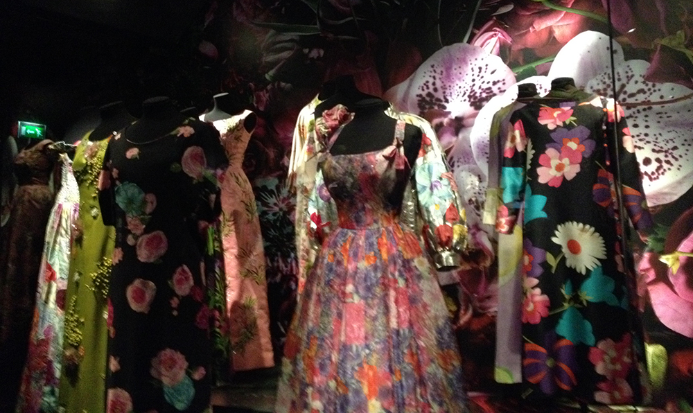
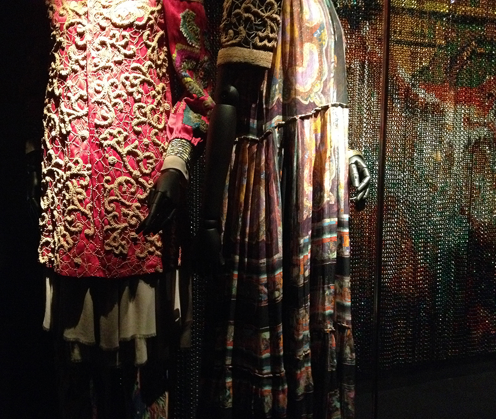
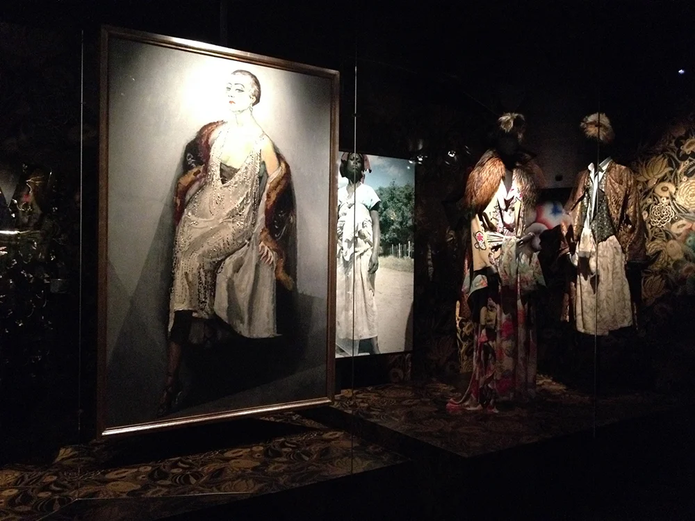
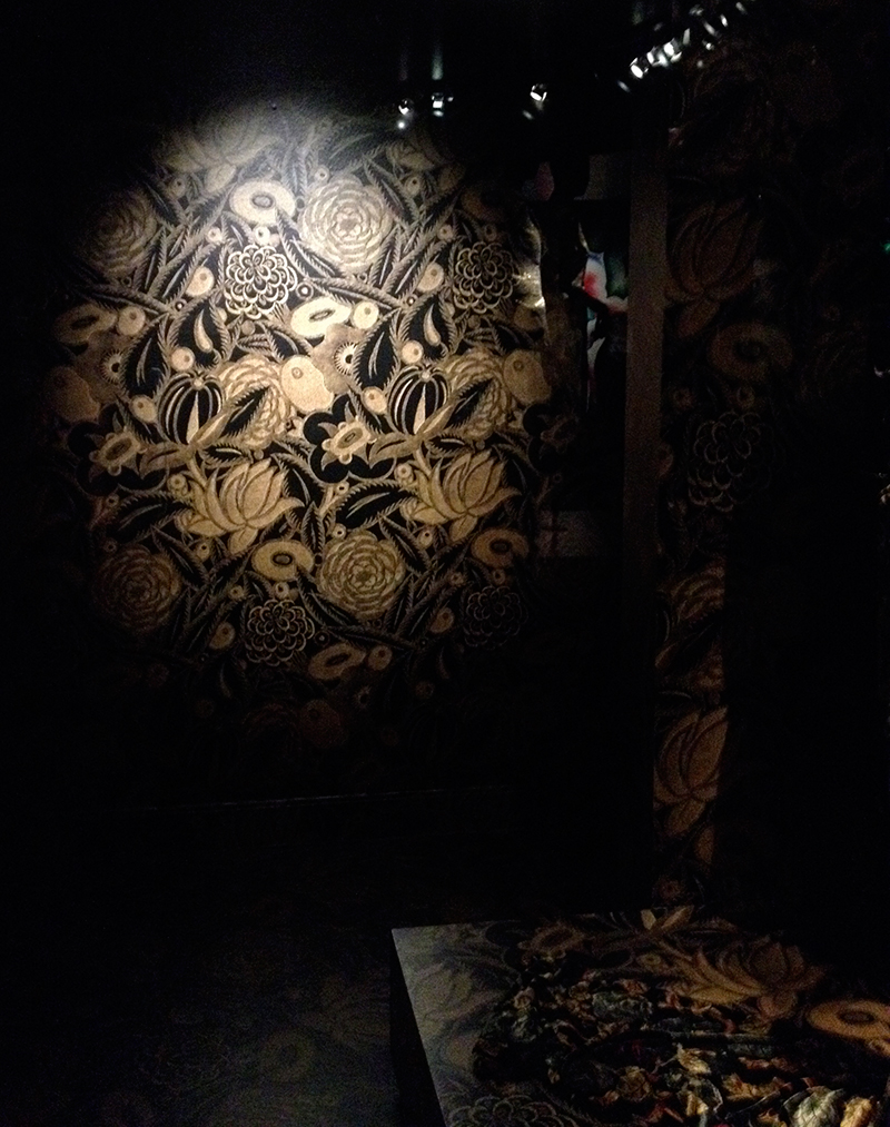
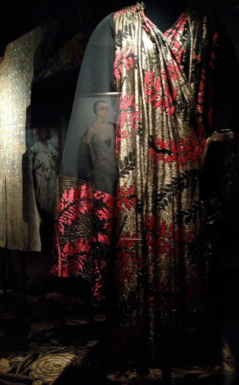
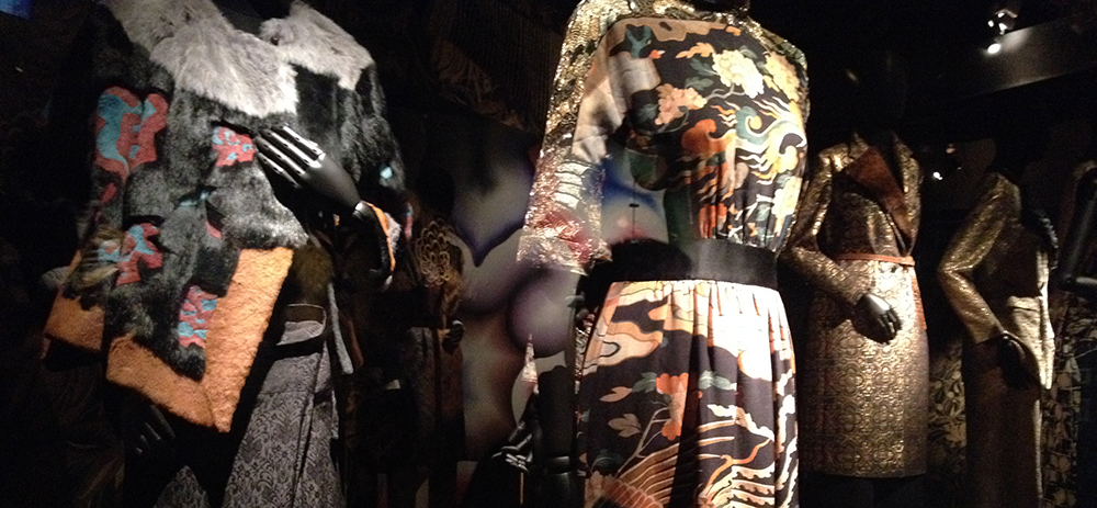
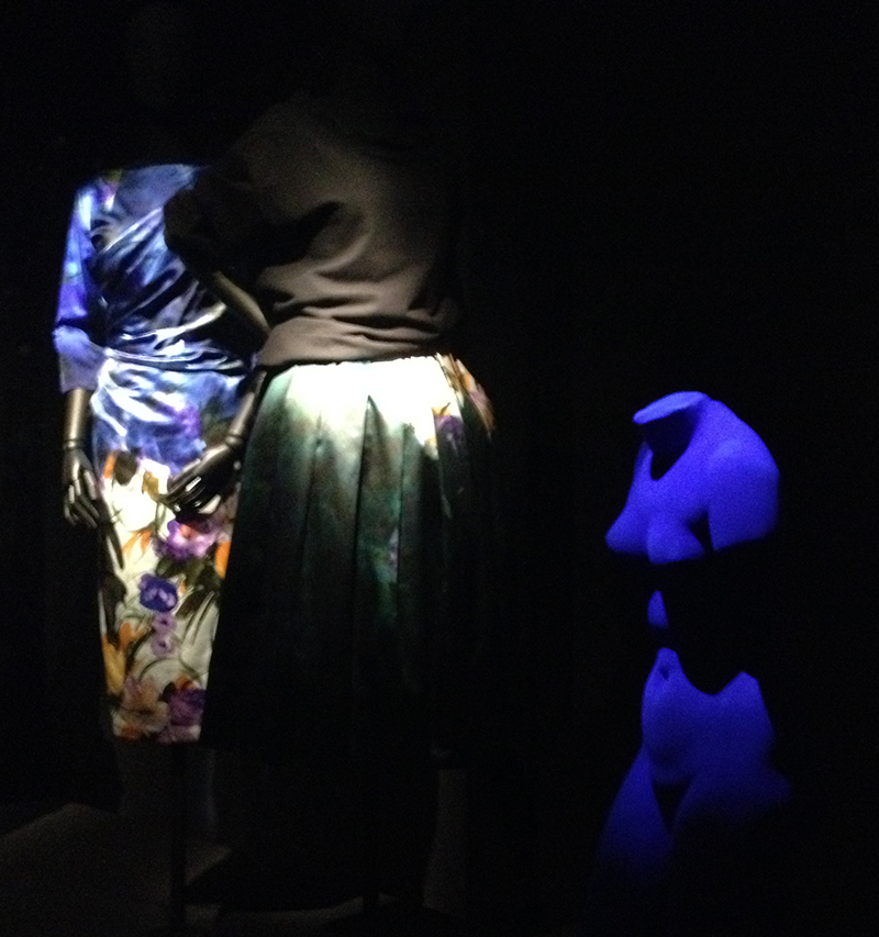
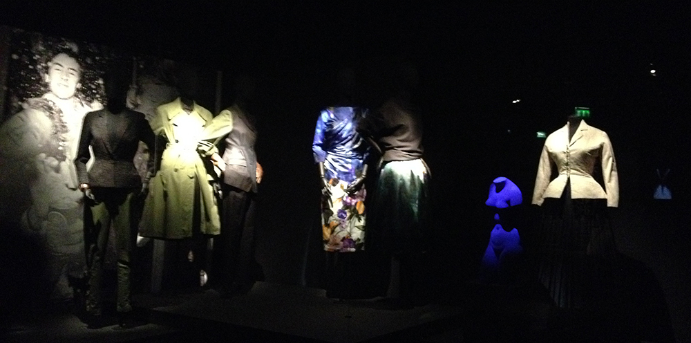
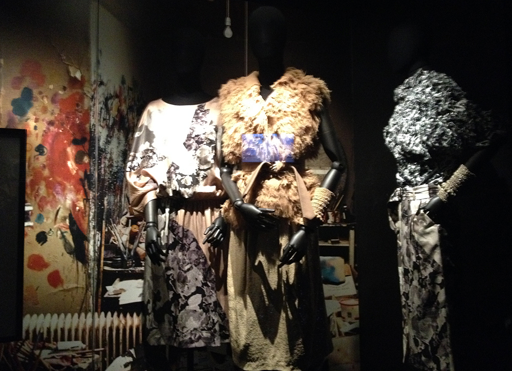
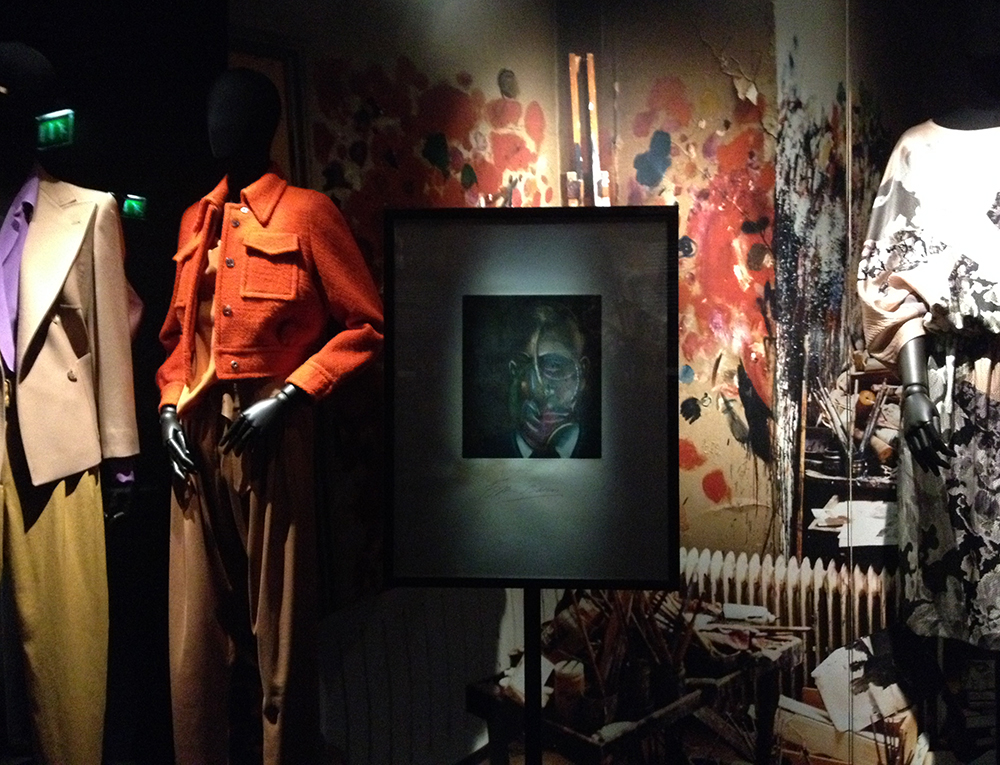
Top on my list for my visit was a trip to Les Arts Decoratifs for the Dries Van Noten exhibit that I had been dying to see for months. Luckily I caught it just before it closed. I took loads of photos and am excited to share them with you here!

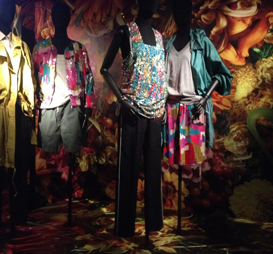
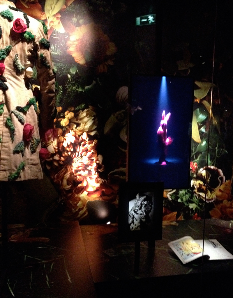
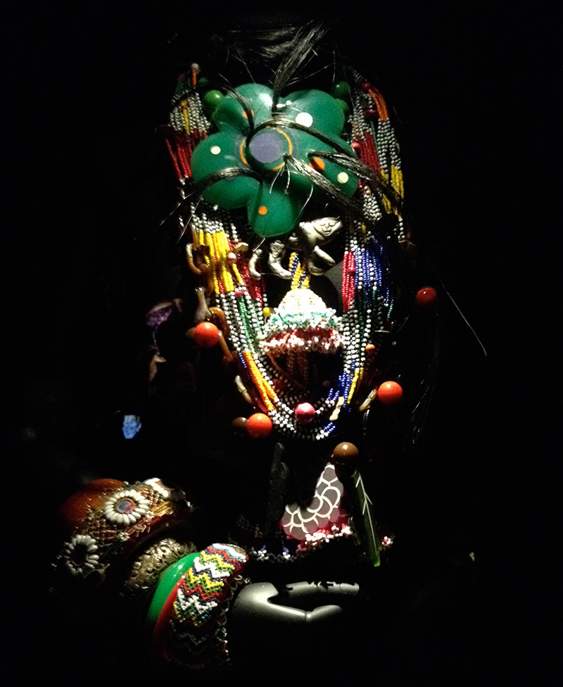
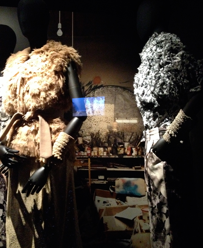
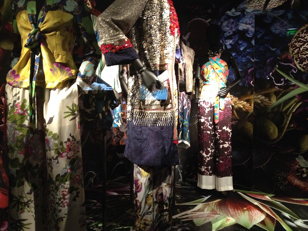
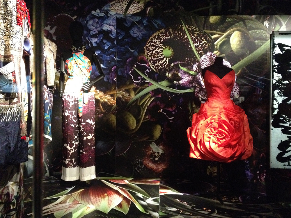
Dries Van Noten is a master of colour and print and has been one of my favourite designers for a while now. The best part of this exhibit is that it was a three-dimensional moodboard of sorts. His eclectic inspirations – from paintings by John Singer Sargent and Damien Hirst – to ancient Chinese robes – were on display alongside his incredible designs.

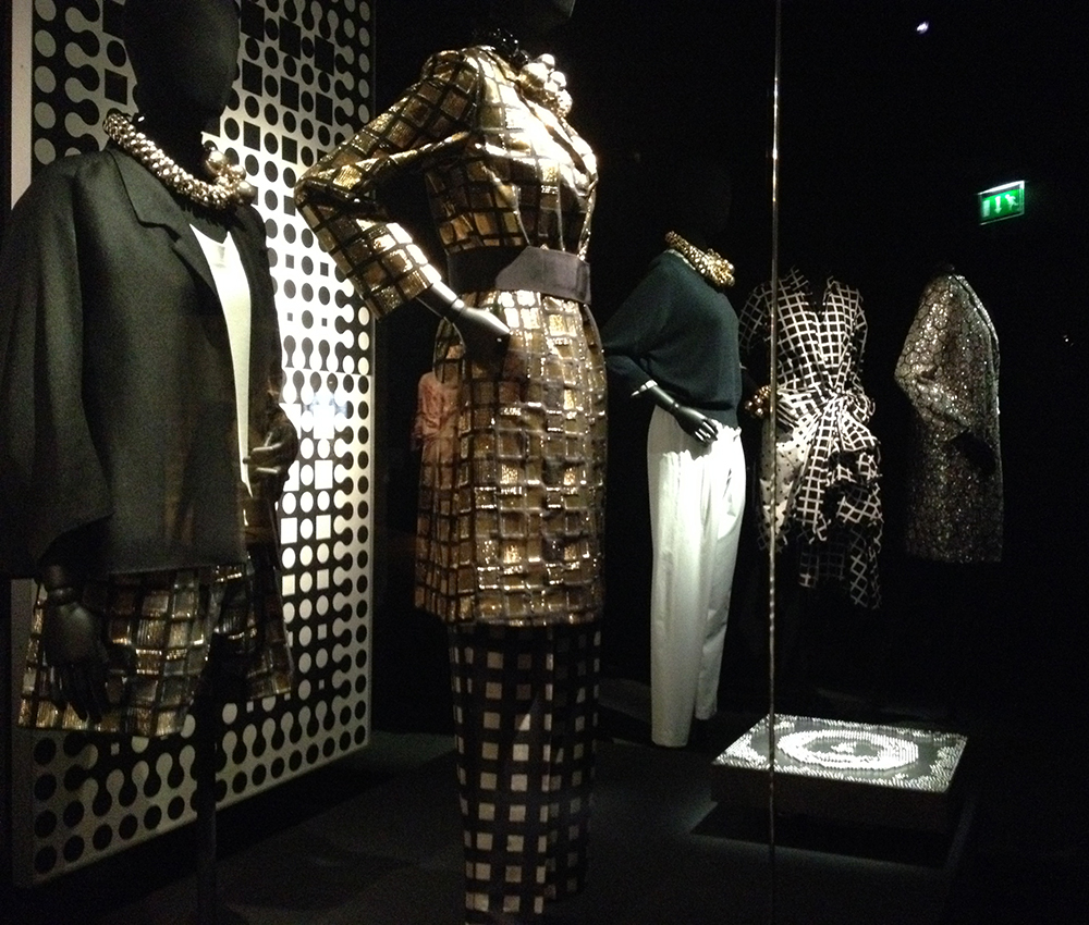
The themes of his collections over the years have ranged from butterflies, representing the ephemerality of youth to the graphic and reduced palette of optical illusions to the transformation of camouflage from something that obscures and hides to something that highlights and adorns.

Here are some of my favourite vignettes from the exhibit, along with some context around the designs and inspiration.

Butterflies

Butterflies bring to mind colour and weightlessness, but also symbolise an oscillation between beauty and cruelty and the ephemerality of youth. The opposing forces of strength and fragility + freedom and rebellion are embodied in the butterfly

Optical Illusions

The nonchalance of 1960’s Paris and the sensuality of Serge Gainsbourg’s music are brought to mind by the graphic, reduced palette.

The Duke

The Duke and Duchess of Windsor provide a point of inspiration for this collection that references nobility and the subversion of British tradition. The boundaries of a masculine wardrobe are questioned.

Garden Camouflage (click on the arrow on the right hand side to see all images in the gallery)

Camouflage sheds its military connotations and becomes something lush and decorative. Texture, shadow and materials take centre stage in this homage to verdant nature. Camouflage is no longer used to hide, but instead to adorn and highlight.

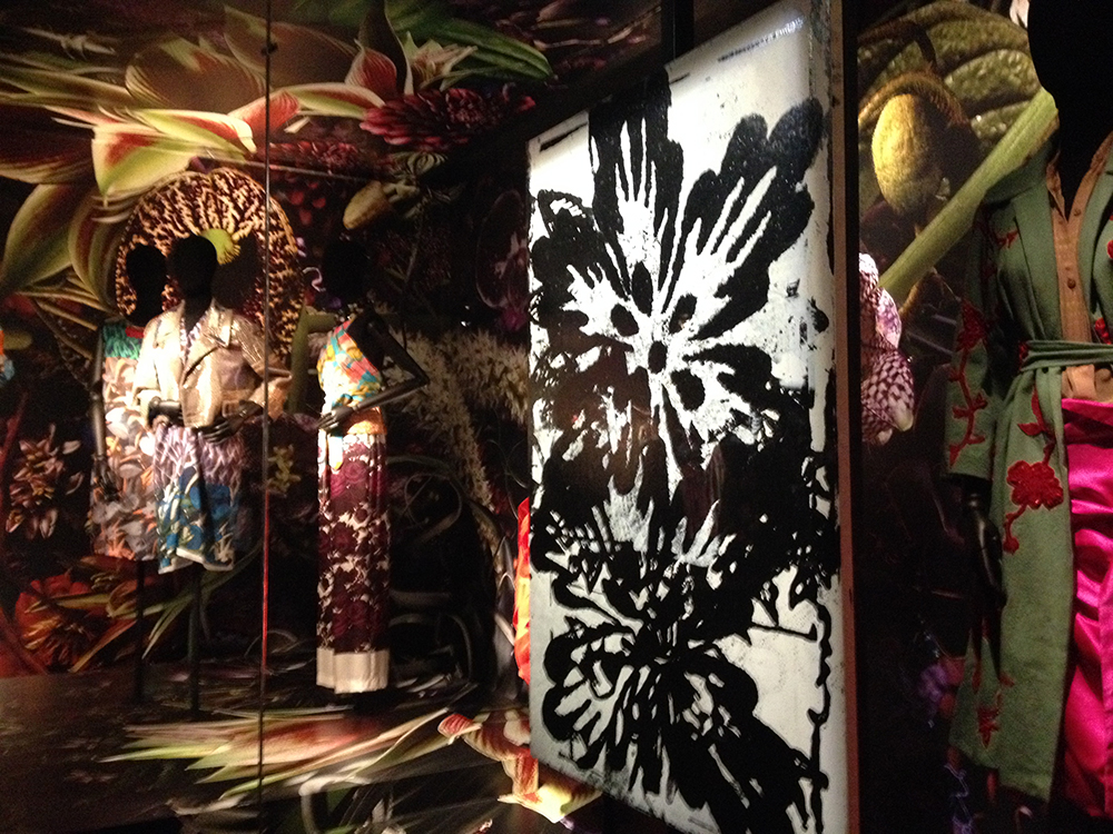
Orientalism (click on the arrow on the right hand side to see all images in the gallery)

This is a land of nostalgic dreams – one of porcelain, postcards from a faraway land, rice paper and travel artefacts. Visually, this is one of my favourites, but it’s a loaded topic and one I will revisit on the blog at a later date.

Additional images from the exhibit (click on the arrow on the right hand side to see all images in the gallery)

And here are a smattering of other images from the exhibit, from collections around themes such as Jane Campion’s movie The Piano and Folklore.

If you’ve enjoyed this post, you may also want to check out the collage I put together of images from his Autumn/Winter 2014 collection.

I’m interested to know what your favourite theme is from this exhibit? Based on the number of photos I took, it’s a toss up between Garden Camouflage and Orientalism for me.

xo
Liz

Stay in touch: Website | Facebook | Pinterest | Instagram | Twitter


Please click here to subscribe to the Liz Nehdi Studio inspiration journal. You'll get occasional updates, behind-the-scenes shots from inside the studio, styling and trend advice, as well as exclusive promotions (including 20% off your first order!)
Not Too Serious

Liz Nehdi

Collage by Liz Nehdi, 2014. Image credits below

Being an adult doesn’t mean abandoning the silly and the weird. In fact I’m finding that the older I get, the more and more important it is to surround myself with things, moments and people that make me laugh and smile. What fun is life if you’re always taking things so seriously?

Here are a few things that are amusing me today. Image credits and individual images below. I hope they put a smile on your face! What's your go-to source for fun?

An otherwise sexy and sultry moment is injected with a big dose of fun thanks to this awesome watermelon float. Image via Barefoot Blonde

Mr. Potato Head. Tim Burton character. Surrealist doodle.  This skillfully shaded drawing by Francesco Chiacchio is all of these things. Image via Made By Wolf

An appropriate choice for hot air ballooning over the desert. Image via Honestly WTF, which is by the way, a SUPER source for the strange and wonderful
 

Because why SHOULDN’T Ziggy Stardust be immortalized as a hand-knitted doll? Image via The One Who Knits

xo Liz

Stay in touch, learn more and buy:

Portfolio | Website | Blog | Facebook | Shop | Pinterest | Instagram | Twitter

Please click here to subscribe to the Liz Nehdi Studio inspiration journal. You'll get occasional updates, behind-the-scenes shots from inside the studio, styling and trend advice, as well as exclusive promotions (including 20% off your first order!)
Eclectic London

Liz Nehdi

Eclectic London Collage by Liz Nehdi

I’m lucky enough to call London my home. It’s diverse, vast and offers a feast for the eyes. Basically it’s perfect for a creative like me who’s constantly hungry for visual stimulation.

Over the past few months I’ve shared photos from my neighbourhood and I’ve decided to turn this into a series of vignettes that offer a glimpse into the everyday surroundings that catch my eye and inspire me.

In case you missed them and are hankering for a taste of Notting Hill, you can find my past posts here and here.

I hope you enjoy!

All photos were taken by me. See below for some context around the individual images

xo Liz

The backs of quintessential brick rowhouses against a beautiful blue early summer evening sky. A study of colour, texture, composition and form. Photo taken from a mews in Notting Hill

Layers of graffiti on a wall just off Portobello Road in Notting Hill. Yes, I love traditionally beautiful things and scenes, but I’m also attracted to a bit of grit. The combination of lyrical tags, alternation between hard lines and blurred edges and pops of bright colour against a slightly textured neutral background draw me in

The Trellick Tower is a controversial landmark in North Kensington. It was designed in the late 1960s by Brutalist architect Erno Goldfinger. Let’s just say that it isn’t exactly beautiful from all angles, but in this shot it definitely makes a strong statement against a blue sky with puffy white clouds. A study in composition, pattern and form

A Moorish iron gate guards the entryway to this Notting Hill home. Yes, I love bright colours, but nothing sets them off quite like black and white. A study in pattern (on pattern), scale and composition

Stay in touch, learn more and buy:

Portfolio | Website | Blog | Facebook | Shop | Pinterest | Instagram | Twitter

Please click here to subscribe to the Liz Nehdi Studio inspiration journal. You'll get occasional updates, behind-the-scenes shots from inside the studio, styling and trend advice, as well as exclusive promotions (including 20% off your first order!)